< backSwapCycle:
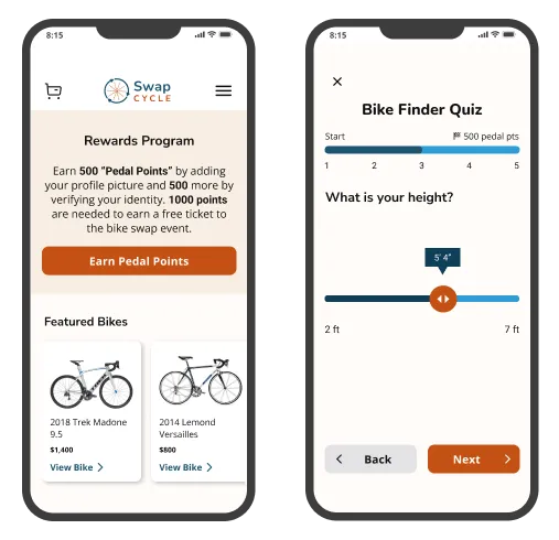
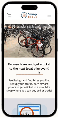
A portion of the homepage and a quiz screen from the website prototype
SwapCycle:
A Mobile-First Website Case Study
Summary
Buying a bike can be confusing and unsafe. SwapCycle is a mobile-first website that streamlines the process and facilitates an in-person event. Users can earn reward incentives, take a bike finder quiz and easily purchase tickets to a local event.
Role
UR / UX / BRANDING / UI / Prototyping
Tools
Figma/FigJam, Google Survey, Otter.ai, Optimal Workshop
Timeline
2023 (~80 hours), 4 Sprints
A portion of the homepage and a quiz screen from the website prototype
The Process
The Problem
The process of purchasing a used bike can be inefficient and unsafe. This means people aren't able to get affordable bikes that meet their needs. There's an opportunity to make finding and purchasing a bike more streamlined and connect more buyers and sellers.
01: Discover
Empathize with and understand users through interviews
Buying a bicycle is difficult so we wanted to gain an understanding of customers’ needs through user research
- Understand their current process
- Understand industry through a competitive analysis
- Get to know what people expected through a quantitative survey
- We wanted to hear about first hand experiences shopping for bikes
- We started interviewing 5 people to gather insightful qualitative data

User interviews were done via video conferencing
Organize and categorize takeaways through affinity mapping/HMW and POV statements
How might we make finding a bike more fun and simplified?
- We found that because novice shoppers don't know what they’re looking for, a quiz would be fun, engaging and informational.
How might we make finding a bike more fun and simplified?
- We found that new users would be encouraged by a rewards point program that gives them points for profile updates and quiz completion.
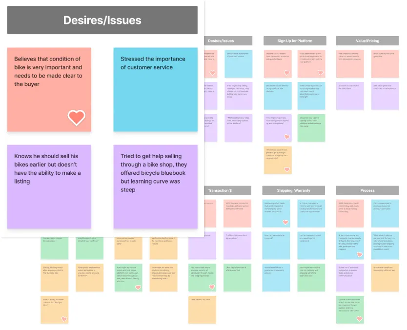
Affinity Mapping showing the Desires and Issues that were discussed

An interviewee stressed the importance of safety and a streamlined process
“I've looked around on FB Marketplace and Craigslist but felt overwhelmed. When I do find a bike to look at I feel the need to bring a friend along for safety.”
Emily
25 y/o Novice Cyclist
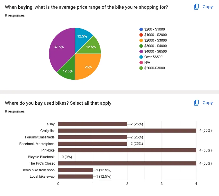
Charting price points and bike purchase locations
What does a Google survey offer?
- Determined it was important to gather qualitative metrics that would help pinpoint an ideal persona
- We needed to know where people were currently shopping and what they’d look for on a new platform
Competitive Analysis: Let's see what the other solutions are offering
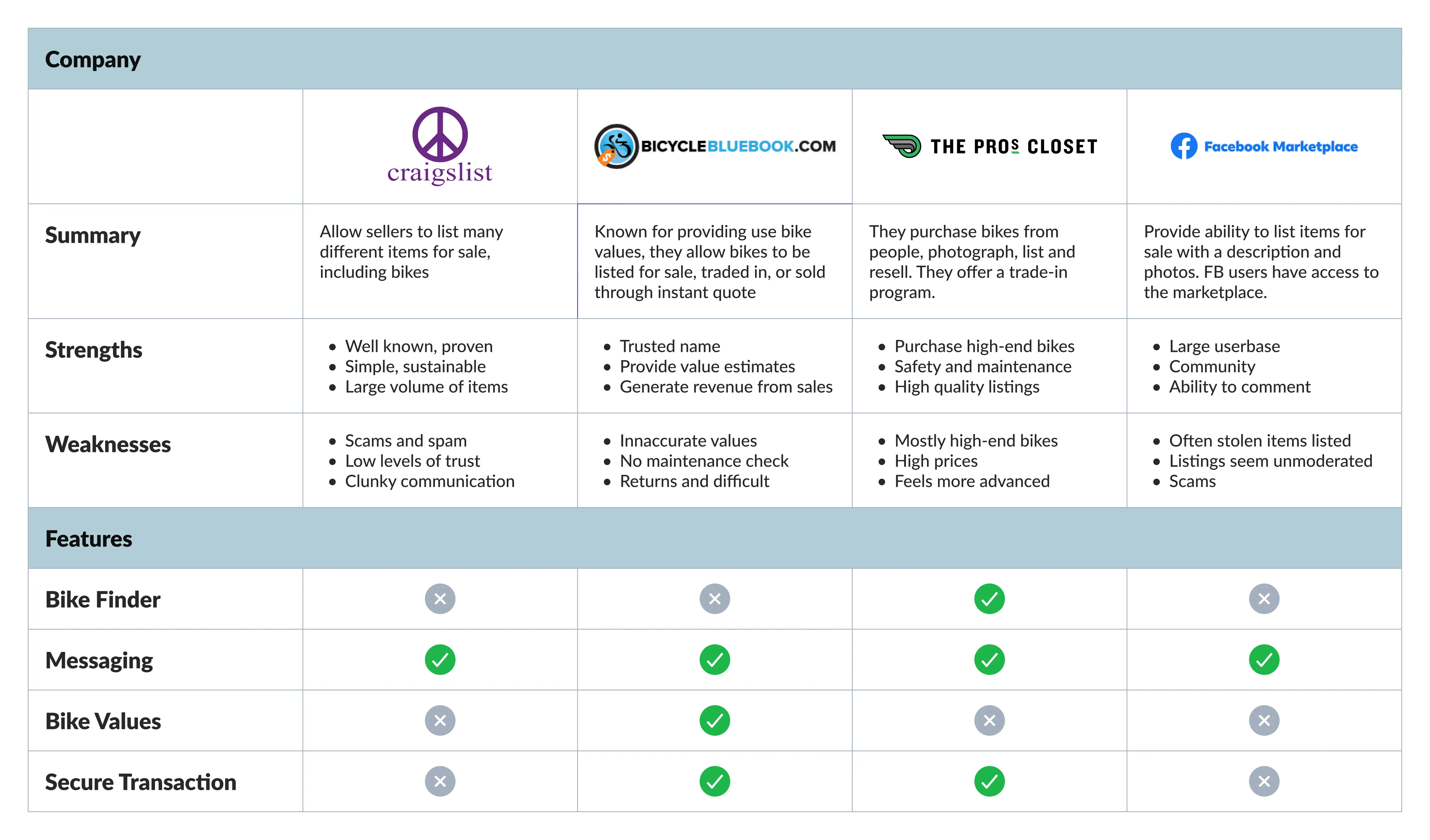
Comparing the competition
Go to the Google Sheet
A future SwapCycle user out cycling
Key Research Takeaways
- The platform needs to support a wide range of users
- Specifically, beginner cyclists who aren’t sure where to start and have a lower budget
- Users should have a feeling of security and safety
- Encouragement may be required
- A simple process to learn which bike is right
02: Define
Synthesize and Organize: Which Persona is the best fit?
- Experienced buyer, hesitant to try new technology and novice but motivated
- Broad range of experience
- Sara Michaels, a beginner with an interest in upgrading her bike stood out as an ideal persona
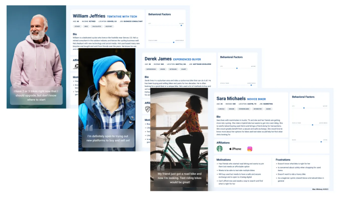
Three potential persona options
Narrowing in on a Persona
- Has friends that are into cycling
- Motivated to upgrade to a road bike
- Would benefit from seeing bikes in person
- Open to new platforms and desires easy sign up and safe transaction
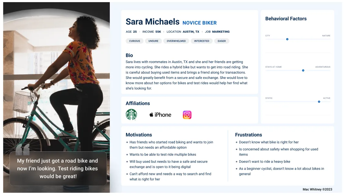
Sara Michaels is a novice biker looking to upgrade her road bike
Go to Figma Persona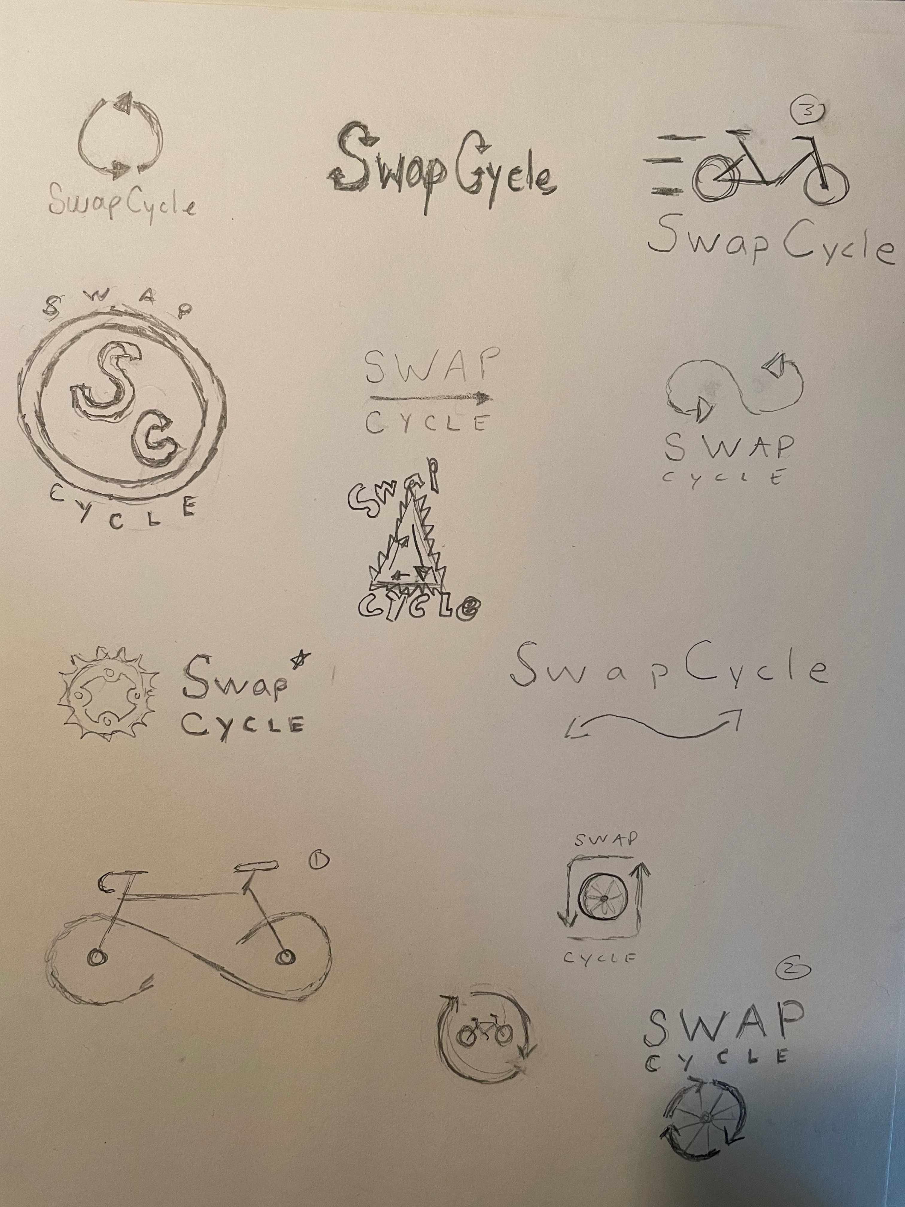
Early branding sketches
03: Develop
The most effective methods that will lead to a prototype
- A sitemap to organize and pages and nav
- Create user flows and task flows to map out a user journey and prevent dead ends
- Low fidelity wireframes establish viability
- Moodboard to set the tone for branding
- Mid Fidelity wireframes provide a more real experience
- High fidelity allowed for branding implementation and preparing for interactive prototype
Task Flow
- Provided a happy path to represent the simple flow of each of the solutions. But what if a user makes a mistake?
SwapCycle Task Flow
See task flowsUser Flows
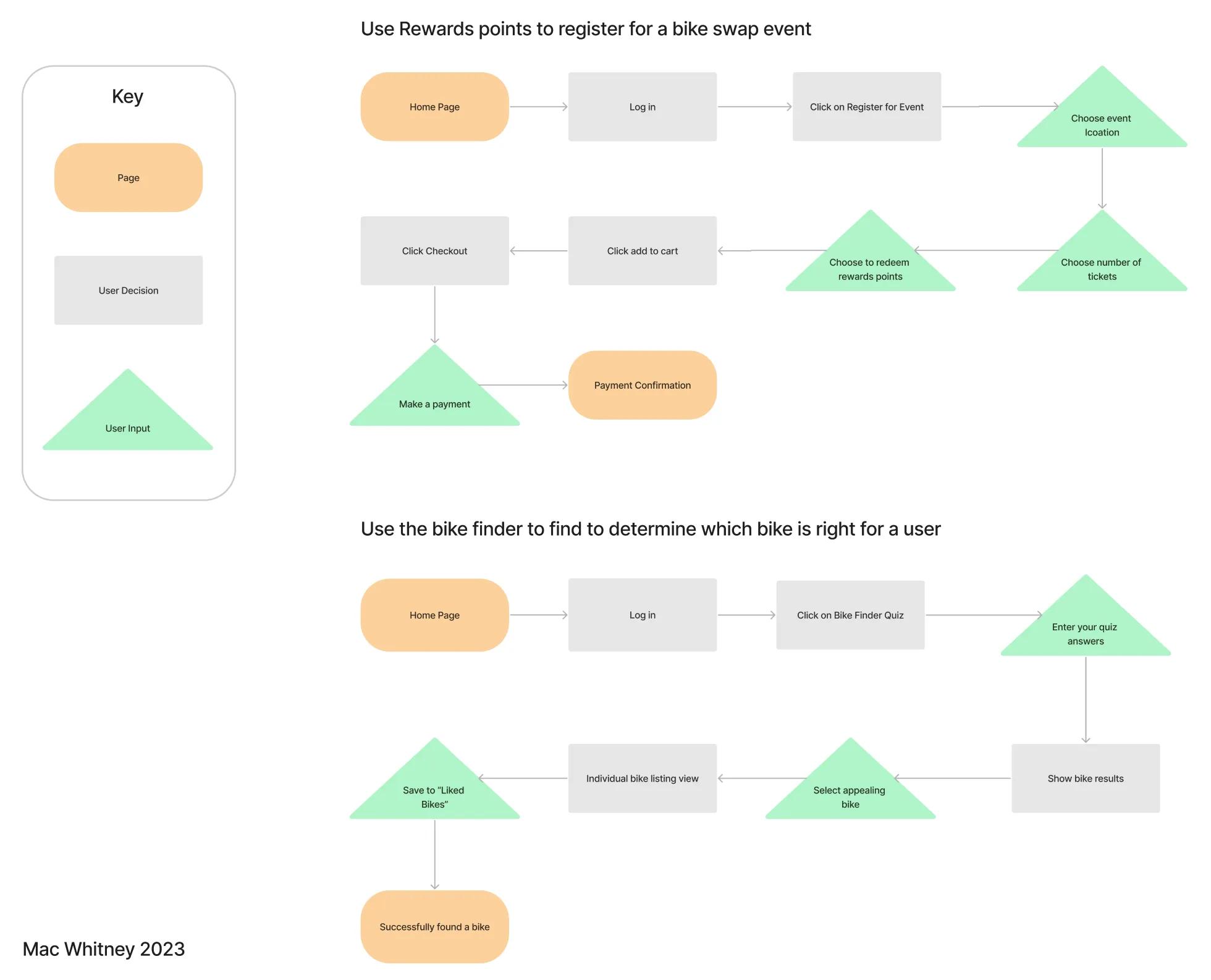
- User flows provide options and represent decision making. This helped to iron out details.
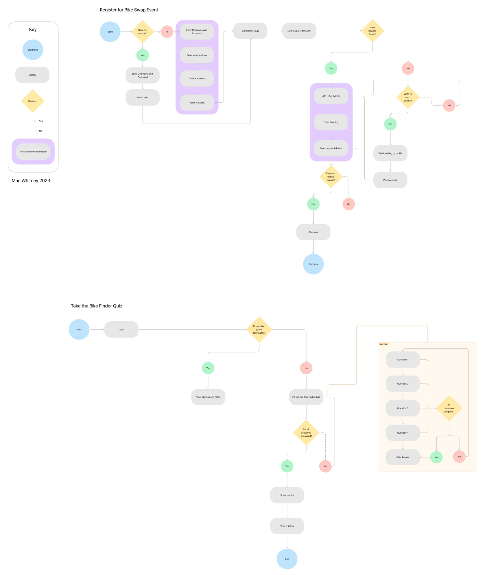
SwapCycle Event Registration and Bike Finder Quiz Userflows
Go to Full User FlowsLow Fidelity Wireframes
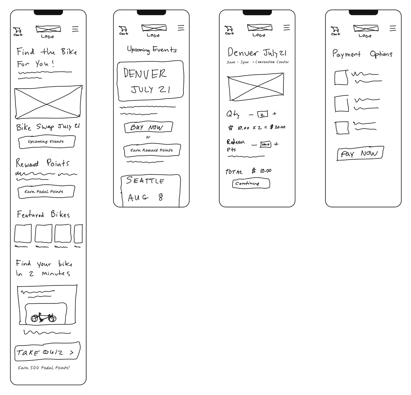
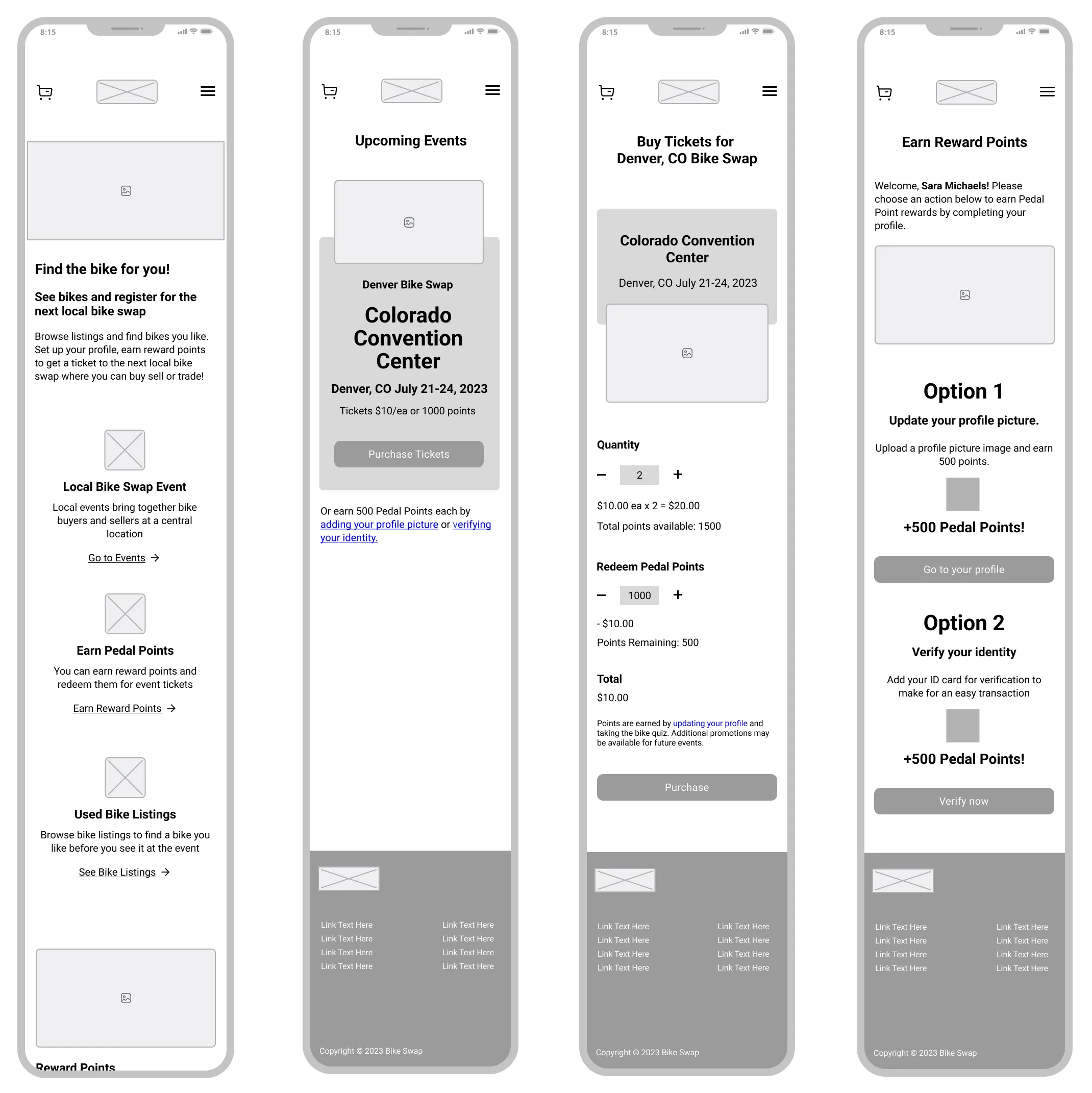
Home Page and Ticket Purchase Low Fidelity Wireframes v1.1
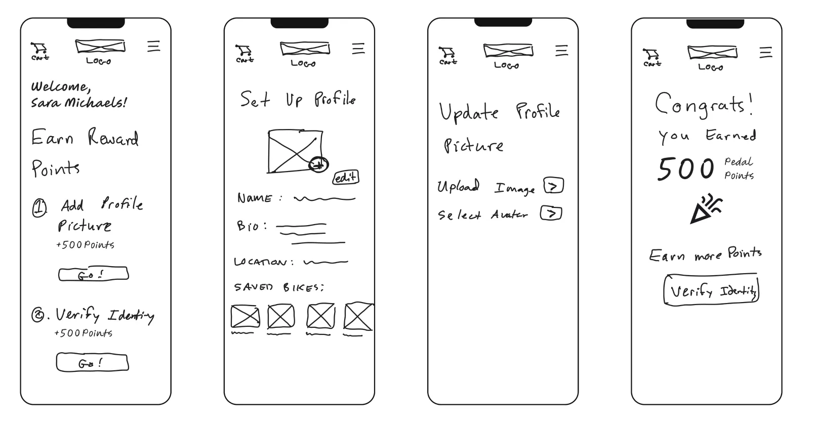
Rewards Points Low Fidelity Wireframes v1.1
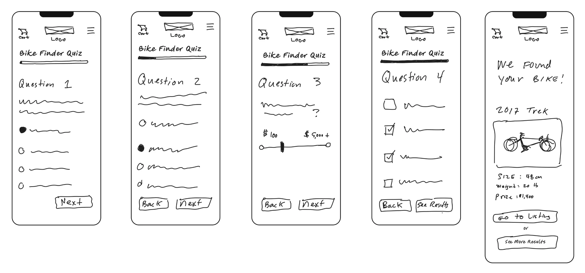
Bike Quiz Low Fidelity Wireframes v1.1
Low-fidelity wireframesMid Fidelity
Mid Fidelity v1.2 - Home Page, Event ticket purchase and Rewards Points screen
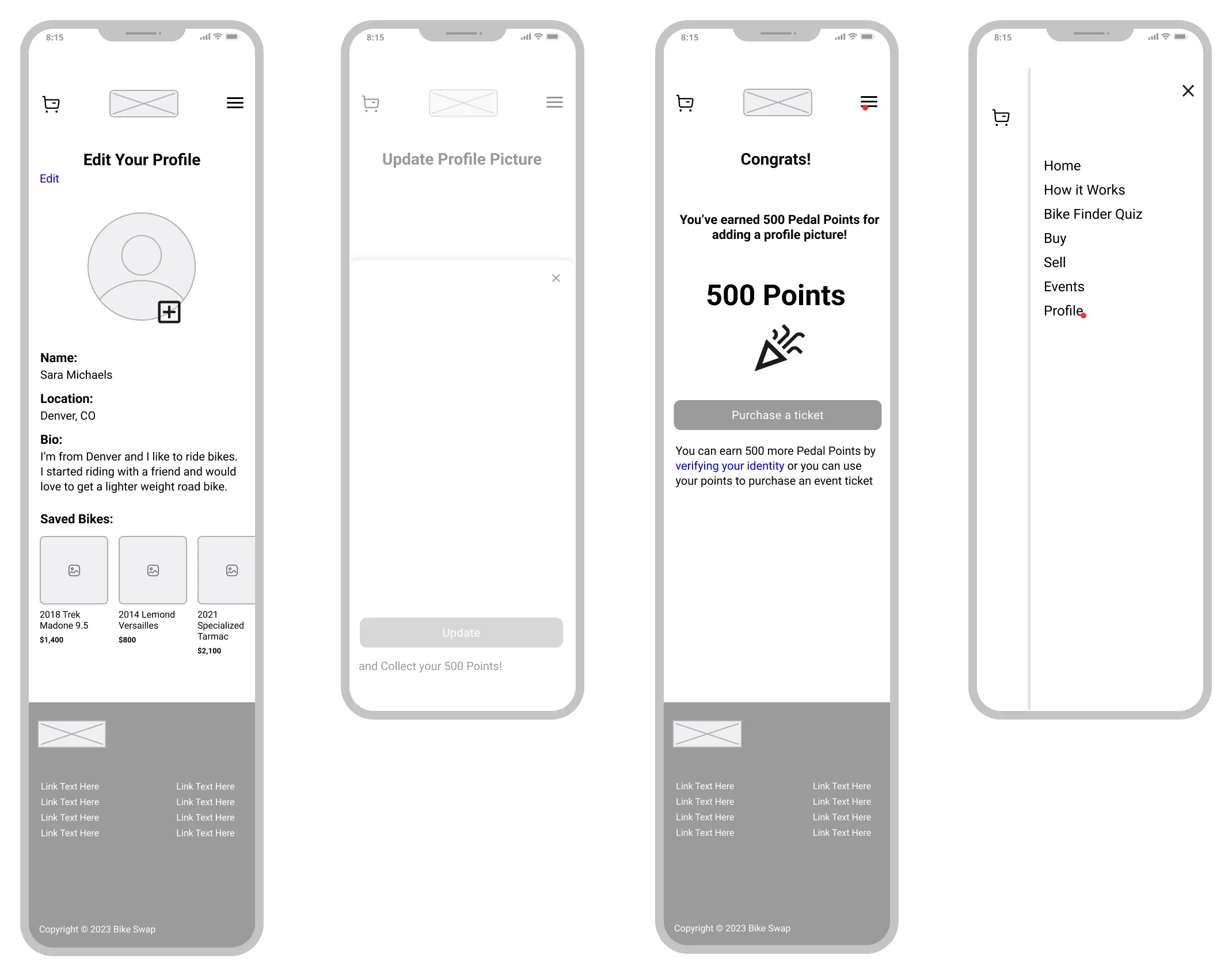
Mid Fidelity v1.2 - Rewards Points Flow
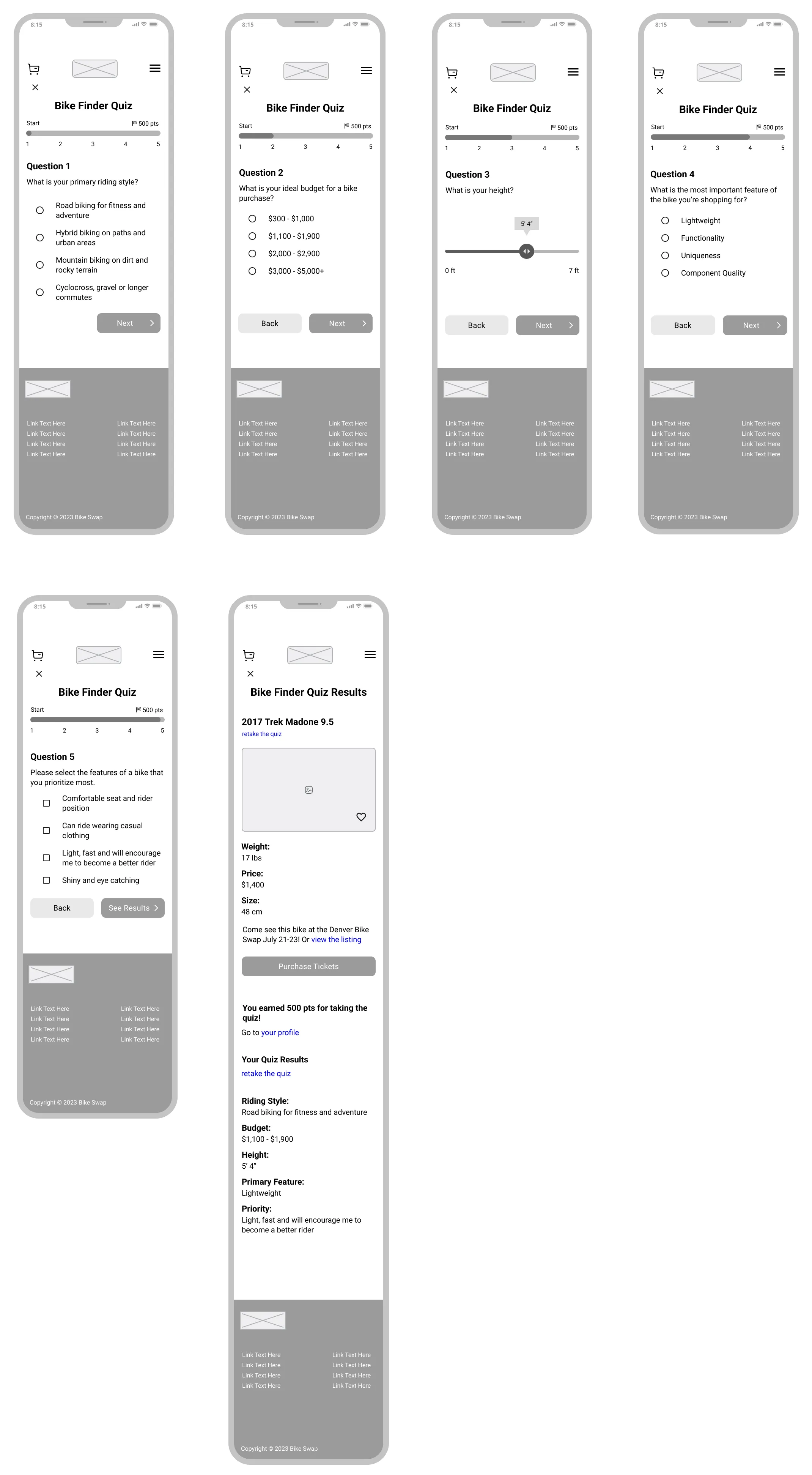
Mid Fidelity v1.2 - Bike Finder Quiz and Results
Mid fidelity wireframesHigh Fidelity Mockups
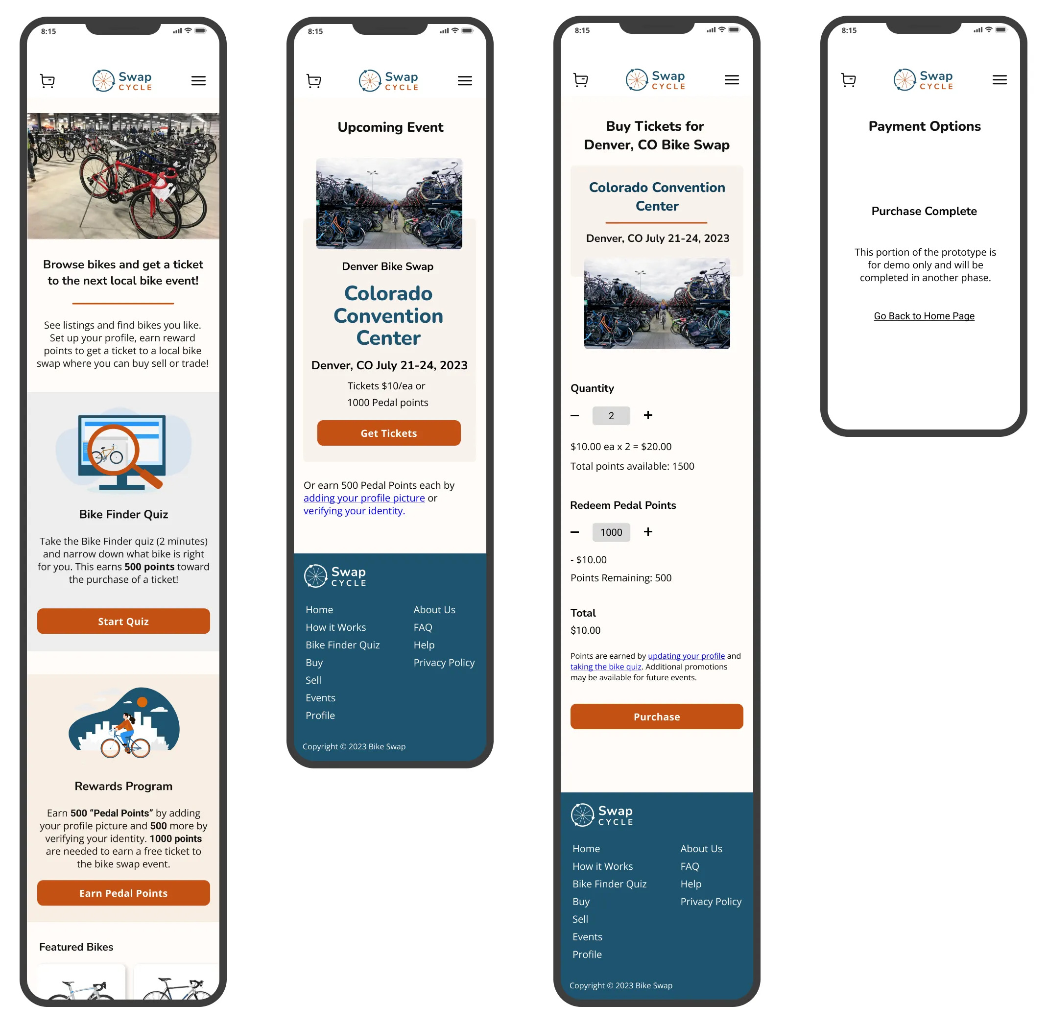
High Fidelity v1.3 - Home Page, Event ticket purchase and Rewards Points screen
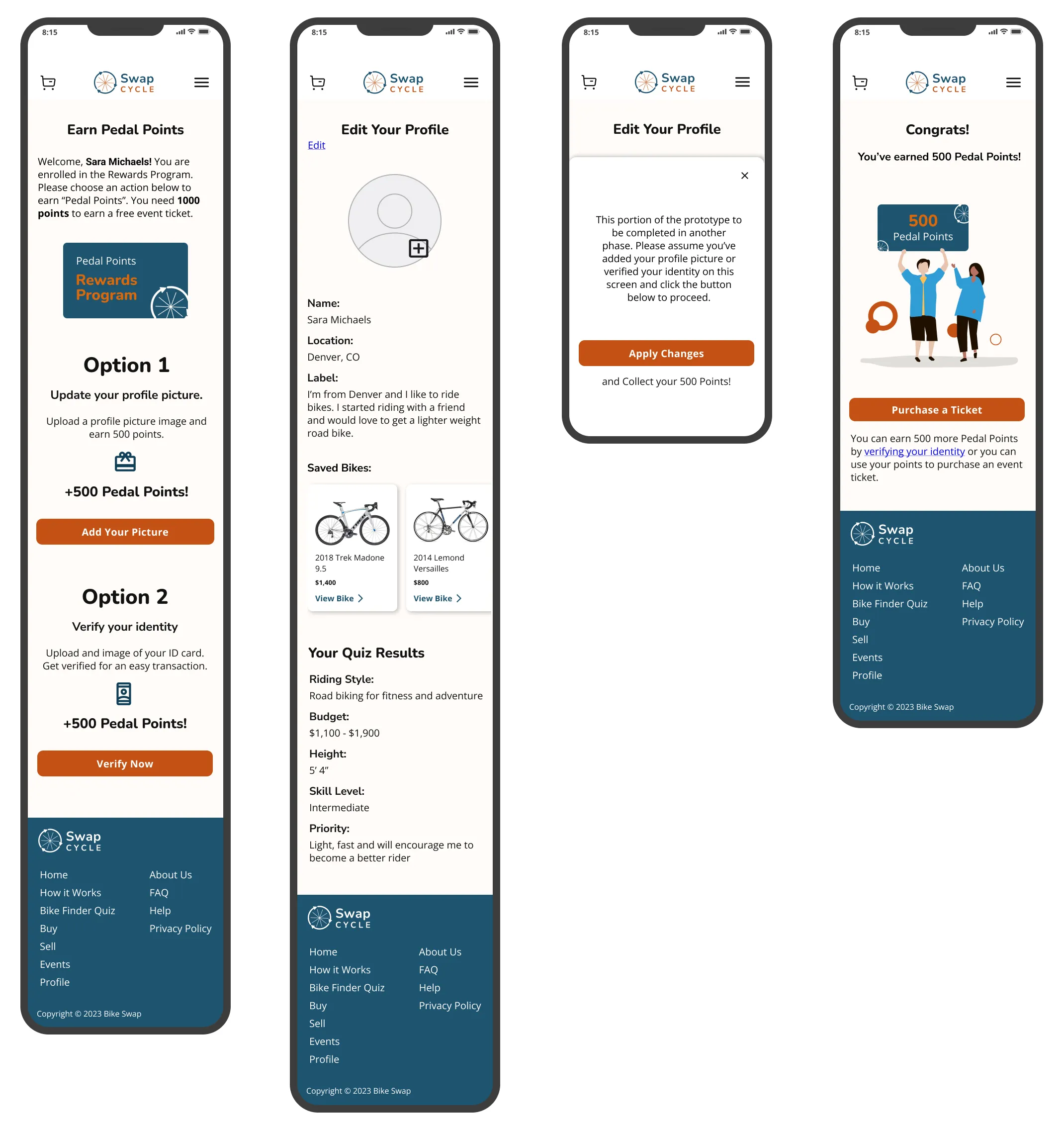
High Fidelity v1.3 - Rewards Points Flow
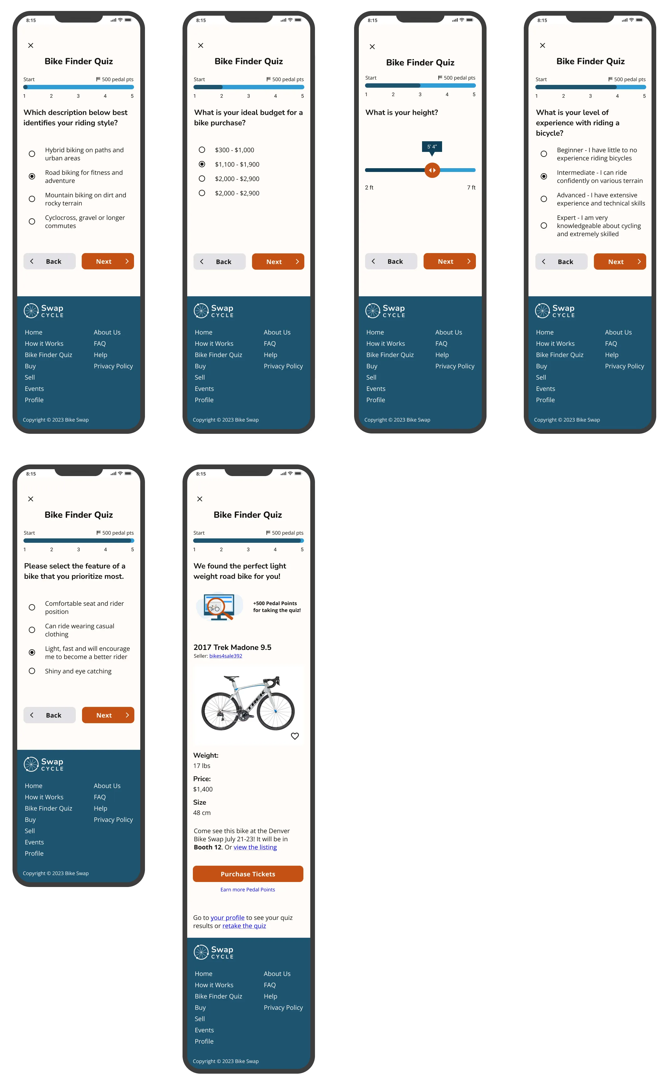
High Fidelity v1.3 - Bike Finder Quiz and Results
Hop into the Figma FileUI Branding: Logos and Icons
- A clear bike theme to quickly communicate the purpose
- Icons represent shopping, bike listings and making a purchase
- An event icon featuring a bike to tie it together
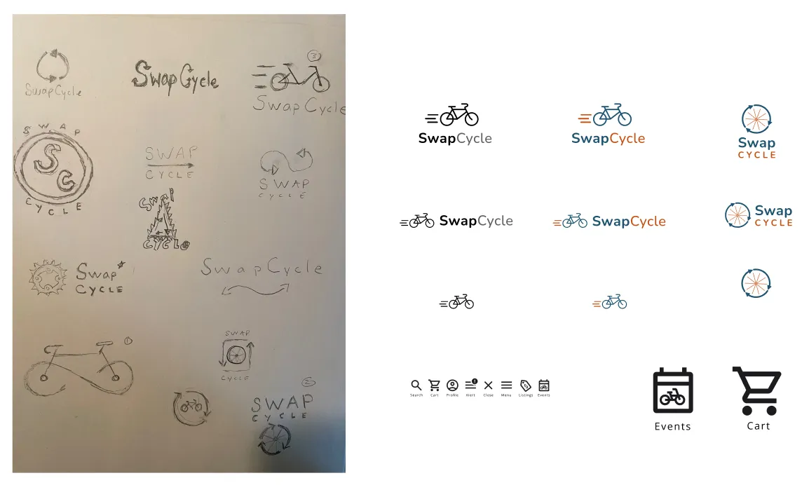
Progression of logo and icon development
What colors will best create an environment of safety?
- Represent Safety
- Invoke Trust
- Have a universal Appeal
- Ensure accessibility
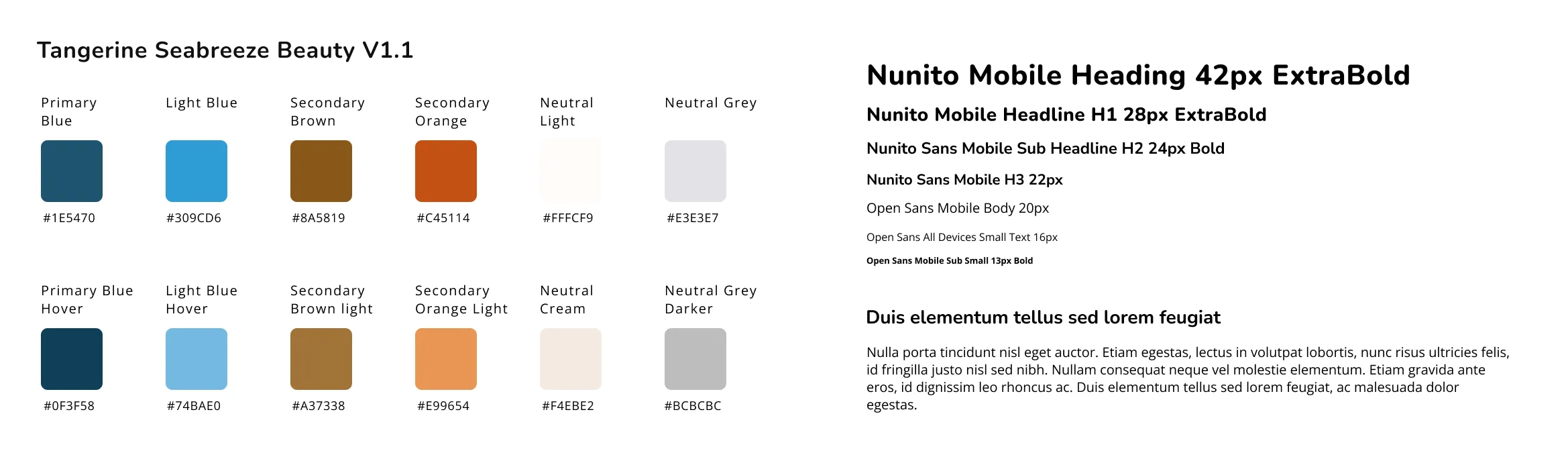
SwapCycle style tile
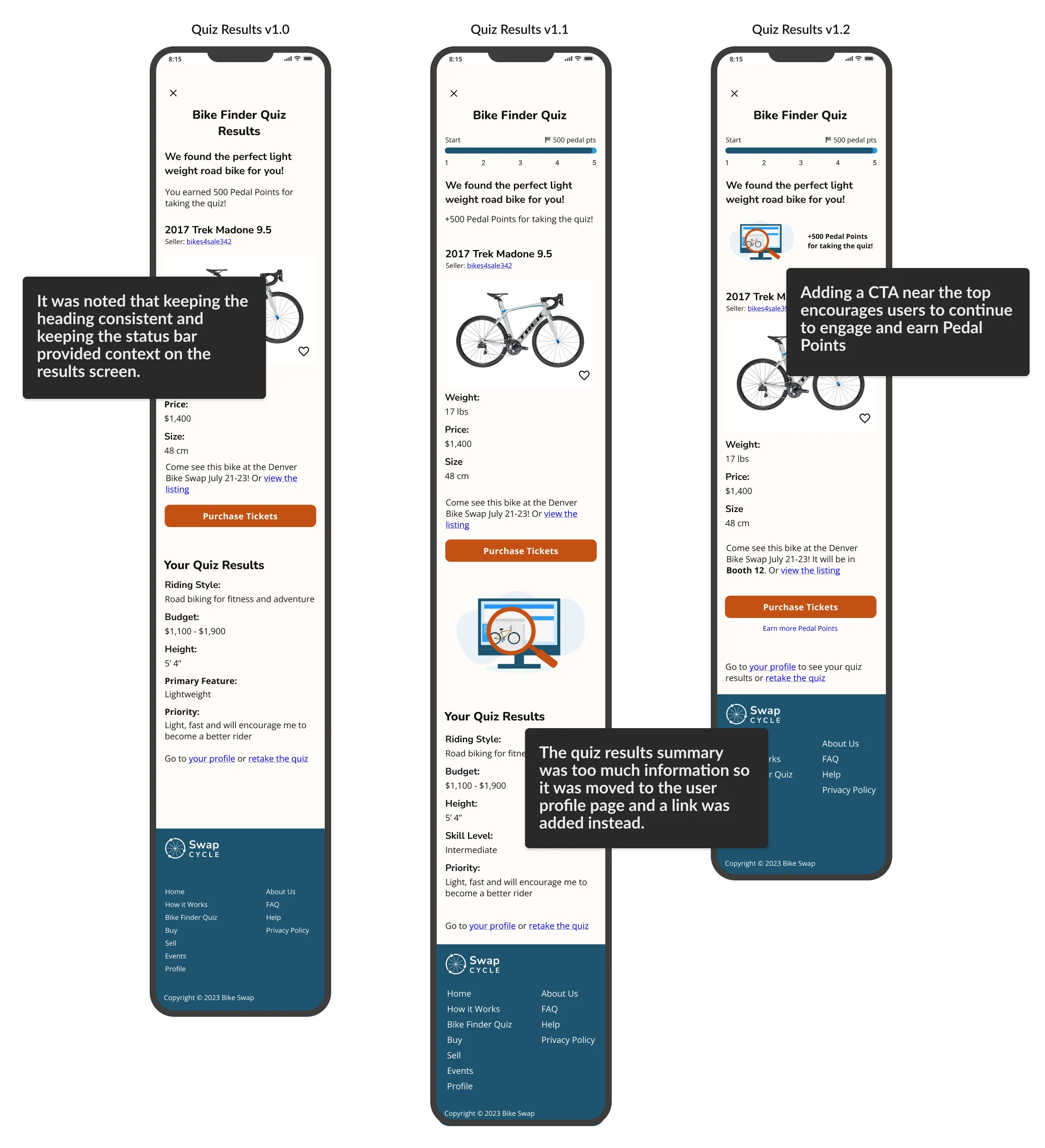
View the style tileEvolution of the Bike Finder Quiz Results Page
- The results page was initially too long and felt clunky
- Ensure user is aware they've completed the quiz
- Introduced a CTA that allows a user to earn Reward Points
- Removed result details and made link available to their profile
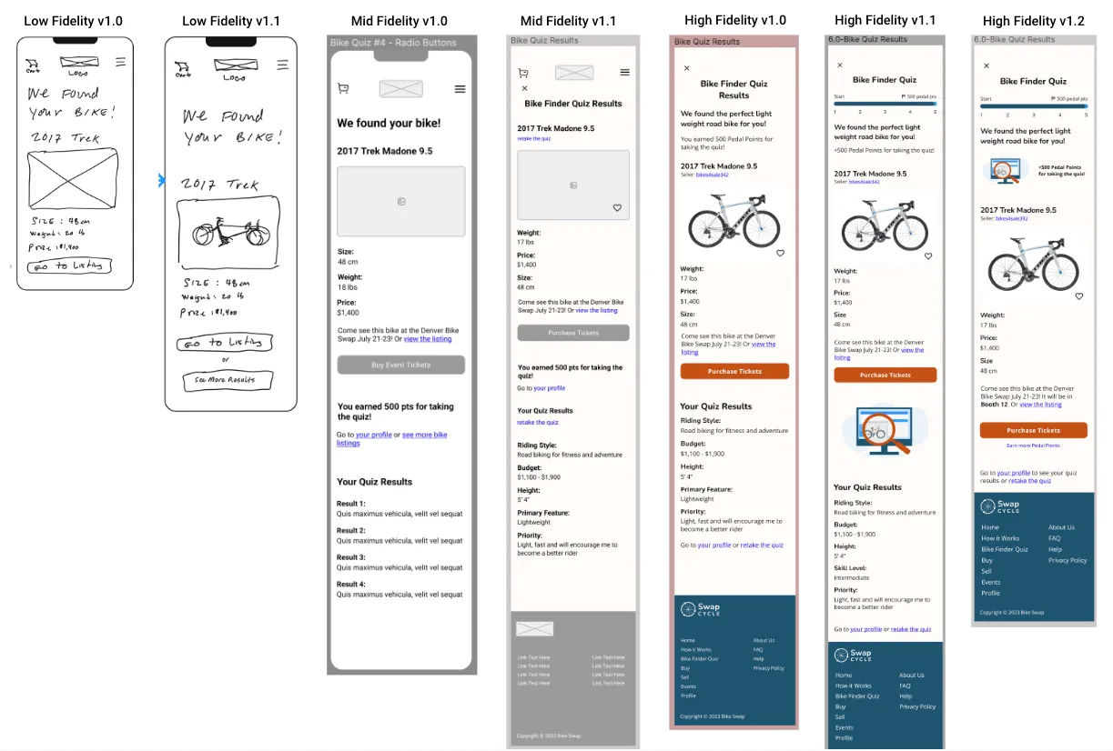
From sketch to high-fidelity, the results page became more focused on rewards points and ticket purchase
Prototype created in Figma
04: Deliver
It's time for the prototype
- Interactive
- Demonstrate flows
- Allows for first phase of usability testing and feedback
Usability Testing
Let's get some feedback
- Moderated qualitative observations
- Unmoderated qualitative observations via Maze
- iPhone mobile device
- Test subjects will be asked to speak aloud while completing tasks
- Audio recording and transcription will be used for moderated tests via Otter.ai
- Requires interactive prototype
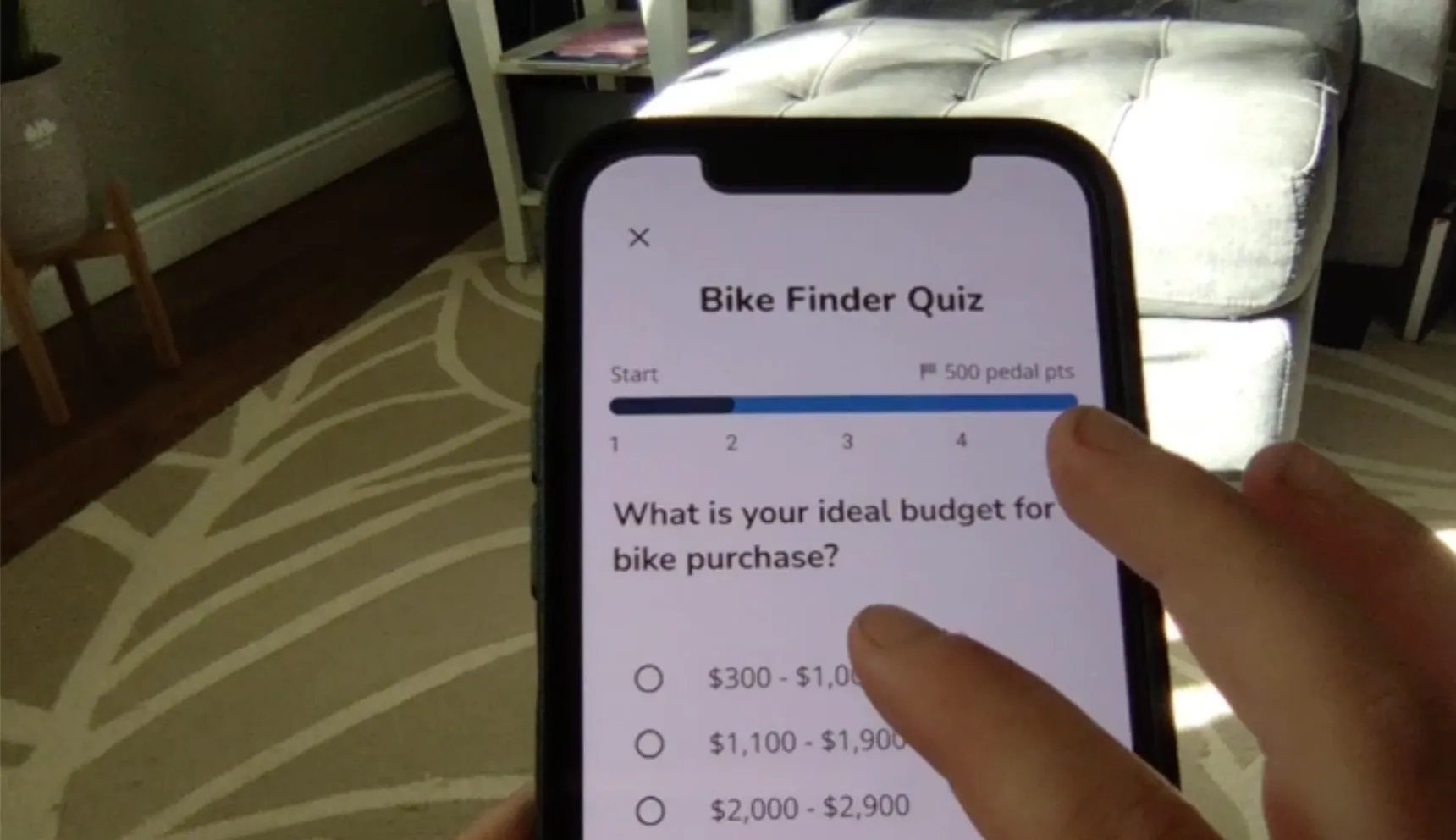
A user testing the Bike Finder Quiz on an iPhone
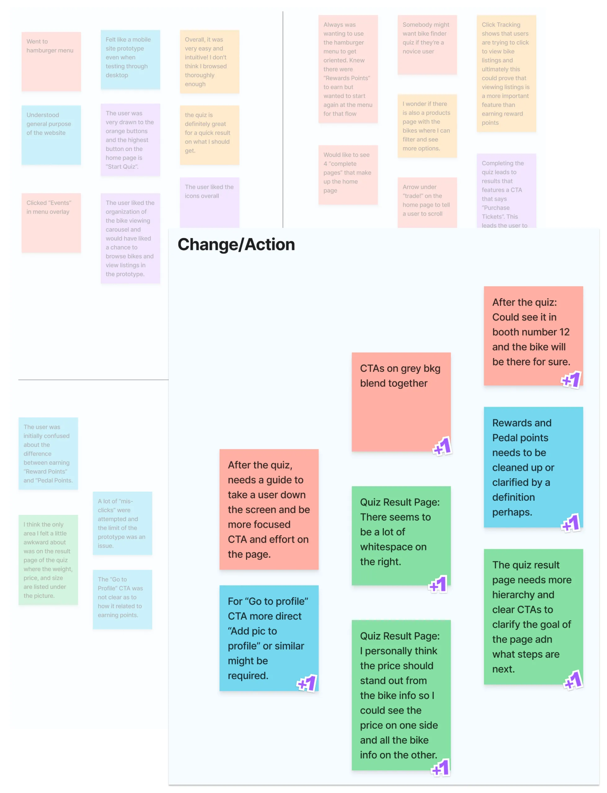
Sorting feedback and getting ready to make changes
Processing the feedback and preparing to iterate
- Quiz results page will be changed to organize the information better and add CTAs to direct users to earn Rewards Points.
- Update Pedal Points and Rewards terminology to increase consistency.
- Adjust top of home page to encourage scrolling
- Differentiate the two large CTAs that have a grey background on the home page.
- Update copy to clarify that there is only one upcoming bike buy/sell/trade event.
- Update the menu to match the home page
Iterate: Quiz Results
Summary
- Based on feedback throughout and usability testing
- Was confusing, too busy, unclear
- Provided more clear path, less information, and guided the user to purchase tickets or earn reward points
Changes to the Bike Finder Quiz Results Page
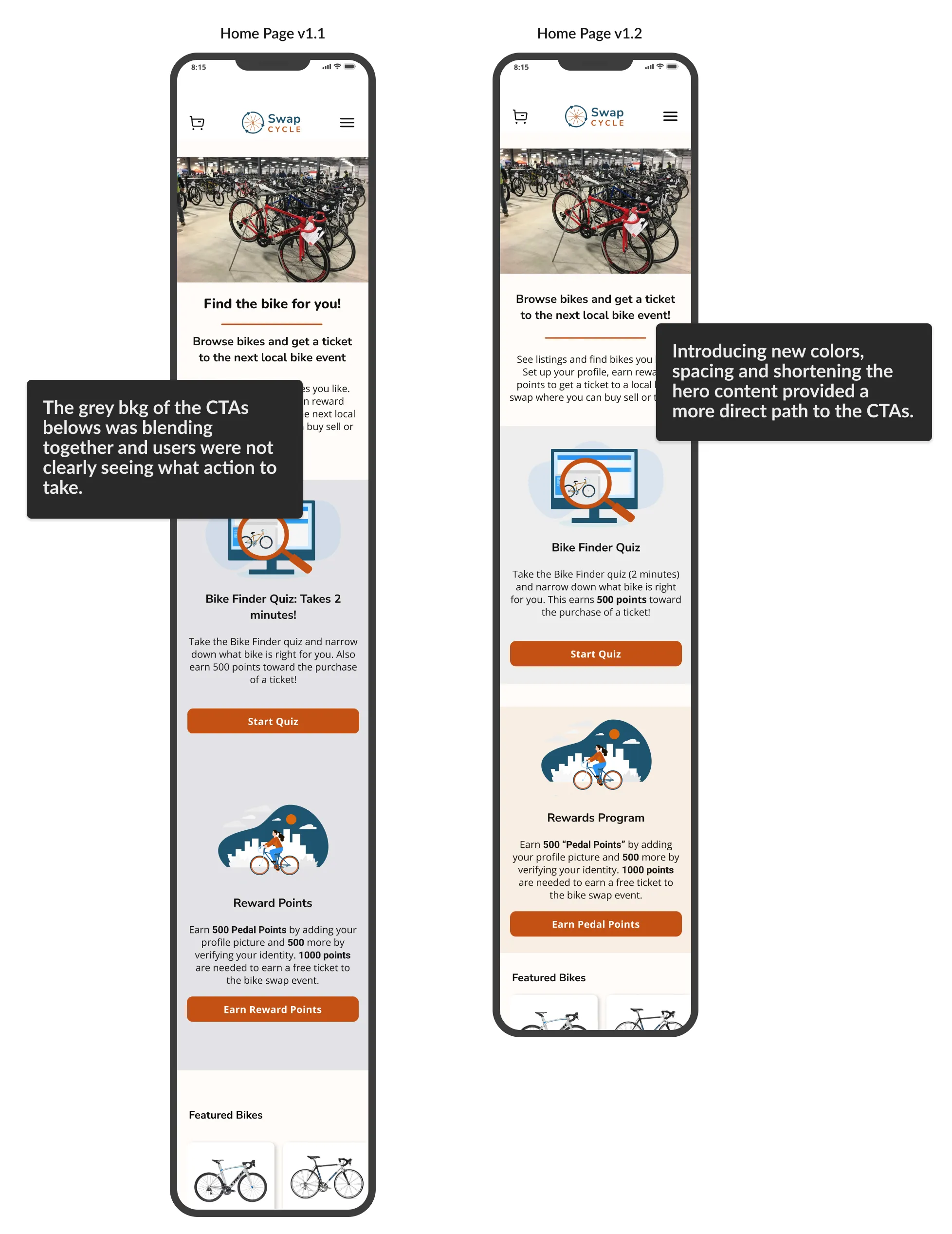
Home Page: (L) High Fidelity v1.1 - (R) High Fidelity v1.2
Iterate: Home Page
- Home page didn’t feel scrollable
- Too much intro text
- Users were drawn to the hamburger menu
- Reducing copy revealed CTA image below
- More focus on content below rather than text above fold
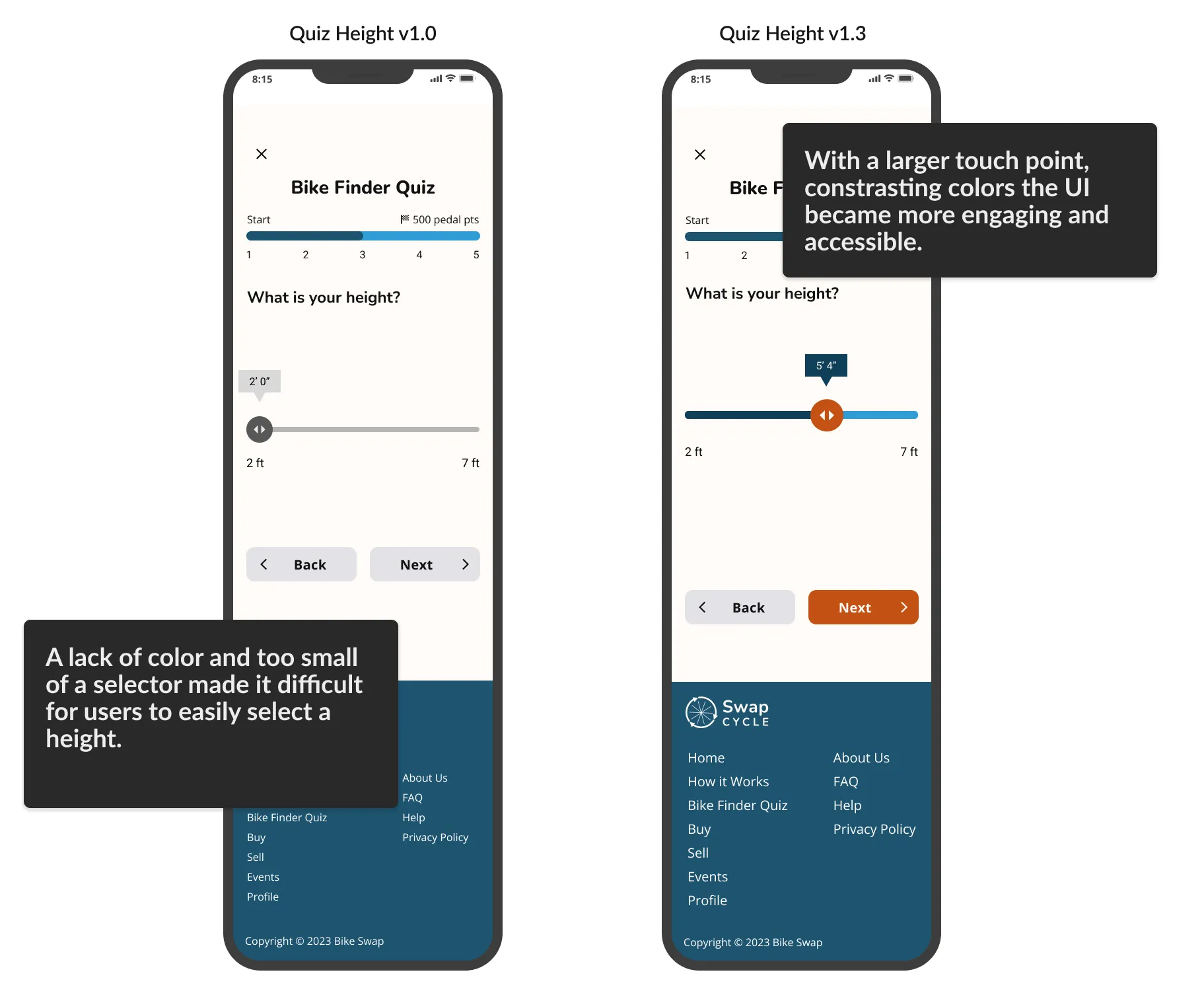
Iterate: Quiz UI for Height Selector
Issues and Solution
- Not engaging or easily used
- Added color and increased overall size
The CTAs of the home page are more distinct with different bkg colors
Outcome
Through UX Research, branding, prototyping and iterations based on user feedback, we created the foundation of a mobile-first website that will allows users to join the SwapCyle platform, learn what bike is right for them and purchase a ticket to an in-person event. This allows them to safely meet a seller, test ride a bike and make a safe transaction.
Summary and Key Takeaways
- Within the scope and constraints of the project, a lot of progress was made toward creating a mobile-first website that provides a platform for buyers and sellers to connect at an in-person event.
- There is a lot of potential for appealing features on the platform. Next steps would include finalizing the checkout process, integrating a payment solution, expanding on the user profile interface to create a comprehensive hub of information and creating messaging functionality to users can connect for in-person or online only transactions.
- According to statista.com, the used bicycle market in 2021 was valued at 5.18 billion dollars. It's expected to grow to 9.44 billion dollars by 2027 so there will be a large number of shoppers looking for a safe way to purchase a used bike!